Sunday, 26 January 2014

Monday, 20 January 2014
My evaluation
This is my evaluation for my As Media
Portfolio, I decided to make an indie/alternative magazine after being inspired
by magazines such as NME, Kerrang and Q magazine.
My research carried out on Survey monkey
showed me that my target audience would be people in social grade D, aged
between 15-25, of white British ethnic origin, and of a heterosexual sexual
orientation. The gender of my target audience would be primarily male but would
not limited to just males.
My magazines was inspired by NME, Kerrang and
Q magazine, I used these magazines in order to research the common conventions
of magazines, in particularly indie/alternative magazines as they fit this
genre well. A large masthead that took up 1/6 of the page became a noticeable
convention across all magazines I researched and so I decided to implement this
idea into the production of my magazine. I also noticed that mastheads were
often bold and gave an identity to the magazine itself and made it a recognized
brand. My mast head follows conventions as it reads Conform which sticks to the
convention of mastheads often being one word. I also decided to use a bold
typography style in order to make the name of the magazine stick out so that it
would be easily recognizable. I also used white, red and black as the color
palette for my masthead, as well as my entire magazine. Using 3-4 colours
consistantley throughout the design of the magazine also became apparent as a
common convention after researching numerous magazines.
I then went onto look at the layout of
music magazines and also create my own. I looked at layouts from the following
magazines: NME, Kerrang and Q before starting. I noticed a common convention of
layouts from the indie/alternative genre was that they were relatively simple,
displayed information in places where the audience could find it easily and
used text boxes to make sections stand out. This was used to represent and
attract the target audience.
My layout follows conventions because it is
simple, lets the text work well alongside the main image and it uses text boxes
to contain parts of the text which need to stand out. I let my target audience
choose the nature of my layout through SurveyMonkey. I asked them what they
would like to see on a magazine and a good layout was high on their list of
priorities.
Also based on my research (primary and
secondary) I chose a layout which followed many of the main stereotypes
associated with the genre. This represents the target audience because it fits
Dick Hedbridge’s theory because it represents youth as ‘fun’. I think my layout
will attract my target audience because it is easy to navigate, coherently and
stereotypically laid out and the barcode is positioned in the conventional
position.
In short, it follows conventions because of
the structure of the page but breaks them slightly because some of the spacing
isn’t perhaps the same as that of conventional magazines.I then went onto look
at the colour palate of music magazines and also create my own. I looked at
colour palates from the following magazines: NME, Kerrang and Q before
starting. I noticed a common convention of colour palates from the
indie/alternative genre was that they were relatively simple, most of them
displayed 3 to 4 main colours which worked well together.
This was used to represent and attract the
target audience. My colour palate follows conventions because it is simple,
uses the colours black, white and red and each colour is used in a different
way to make text stand out. I let my target audience choose the colours of my
colours palate. I asked them what they would like to see on a magazine and
these colours were ones which came up the most. Also, based on my research
(primary and secondary) I chose colours which followed many of the main
stereotypes associated with the genre. This represents the target audience
because it fits Stanley Hall’s theory because it represents youth as
‘rebellious’.
I think my colour palate will attract my
target audience because of the colours used and their connotation and also the
way that different colours are used to portray different needs. In short, it
follows conventions because of the colours used, but breaks them slightly
because perhaps it doesn’t stand out from the crowd as some of my competitors
do.
The main image for me had to be attractive
and convey the genre of the magazine to the audience. My model was a female who
was in the age category of my target audience, hopefully making it easier for
them to connect to magazine itself. Her dyed hair and risqué look only
emphasizes connoted rebellion which the audience of my magazine would
potentially be themselves. The typography of my magazine needed to represent my
audience as well, the common conventions of typography styles in magazines were
often bold and the words used were often short. I also added a bar code on my
magazine as room for the barcode would need to be incorporated into my magazine
if it were too be published and sold as a commercial piece of media.
I think that my typography styles and
colour worked well and represented the audience. They did this through bold
lettering and colours which fit together to represent the common convetions of
the genre.I also think that I could perhaps improve my image on the cover as it
doesn’t perhaps look as professional as I would have liked.
In terms of my contents page I noticed
through researching NME Kerrang and Q that there was oftena feature story, I decided to incorporate this
idea into my own work and highlighted the story on the cover, the contents page
and worked it into my double page spread by writing my article on the feature
story. I stuck to conventions in terms of loyout however broke conventions by portraying
images with shot types that are not conventionally shown on a music magazine
cover. Moreover, I maybe used a typography style which didn’t stick 100 percent
to conventions. I do however think that the breaking of conventions would help
in attracting my target audience as it is slightly different to most commercial
magazines and my target audience may be wanting to see something different to
what they are used to.
My feature page was also influence through
researching popular magazines in the indie/alternative genre I noticed that
they all had a large header in a large font in a bold typography style, had 1
main image, however could contain more, showed the page numbers in the bottom
left/bottom right hand corners, bold font size/style and showed stories that
were representative to my audience and their interest in music. I followed
these conventions through adding a large header at the top of the page which
told my aueience what the article was about, showed a large image, taking up a
whole page, used bold font styles and I also used interesting colours that
followed my main magazine colour scheme.
I portrayed a typography style for my main
article which didn’t follow the conventions of music magazines. I think that
this was because I tried to stick to my main magazine font, whereas I should
have tried to portray the genre better.
I think my feature article represents/attracts
my target audience because it fits Hedbrige’s theory of “youth as fun”. It does
this through the large, interesting image and the colour scheme. I think the
colours on my feature article look professional but I would change the
typography as it does not look as good as it could have due to it being out of
convention. In terms of my feature article, I decided to use an interview, I
chose this type of article as it gave the reader a more personal connection to
the star model and potentially is the more interesting choice of article,
compared to a review which is simply someone’s opinion which may lack interest
from the reader’s perspective.
Institution describes the organization or
conglomerate of people that are responsible for the publication of a particular
piece of media. Magazines are created by businesses seeking to generate a
profit by selling their magazine to a particular genre of people. Once the
audience is interested in the magazine the institution attempts to expand. It
can do this in three ways, conglomeration, expansion and diversification. The
media institution is huge. There are currently 2471 consumer magazines in the
UK across a wide range of genres. Readers spend on average £1.46 billion a year
on consumer magazines making it a viable and successful market.
Conglomeration describes the coming
together of different groups working together in order to be more productive
and potentially create a higher quality magazine. It is usually seen as a cost
effective move for an institution as a conglomeration shares the same
production methods, distributing methods and also the same building. Expansion
describes the buyout of a particular successful magazine that will easily and
successfully fit into a collection of genres that the institution owns. The
original owner of the magazine usually benefits well as the buyout is usually
high, obviously depending on the success of the magazine already. The owner can
make a decision to still work on the magazine as their own, however it simply
makes it easier in terms of production and distribution as it now become part
of the institution, where the only real difference in magazine production is
the content. Any addition to the current institution adds to the value of that
institution. Diversification describes the changes made to the product line,
decommissioning and introduction of new magazines and the institution's attempt
to produce magazine production into genres it currently has no influence over.
It does this in order to gain a more diverse and overall larger target
audience.
IPC Media are the leading consumer magazine
and digital publishers in the UK. They publish magazines from a wide range of
genres, from indie music magazines such as NME to woman's lifestyle magazines
such as Now weekly. They are also responsible for publishing newspapers such as
The People and The Sun. The company is divided into 3 main sub headings in
which similar genre magazines fit into. Connect is responsible for the
publication of mass woman weekly magazines. Southbank is responsible for the
publication for upmarket woman weekly magazines. Inspire is responsible for the
publication of men's weekly magazines such as The Field and Rugby Weekly.
Bauer Media Group is a large German
publishing company, headquartered in hamburg. Primarily they publish woman's
weekly magazines and also television listing magazines. Popular brands that are
owned by Bauer Media Group include Bella, Take a break and other popular
television listing magazines. Popular Bauer media brands include Q magazine and
Kerrang! It also has influence and involvement in the radio and television
industry.
I think that my music magazine would be
successful as part of Bauer Media Group, this is because they also own Q
magazine and Kerrang magazine, and could benefit from another magazine of
similar genre but with a slightly different target audience. In other words, my
magazine is similar to Q and Kerrang but
also different enough to attract the attention of Bauer because it is pitched a
a young group than Q but a slightly older group than Kerrang. I would like them
to publish my magazine because it would also ensure my publication got links in
TV and radio.
A key thing I learnt about was how to
create a SurveyMonkey Survey and share it on Facebook and Twitter. This was an
excellent way to conduct research as I could reach more people in my primary
target audience quickly and the technology generated graphs for me.
Another new piece of technology that I used
was called Prezi which allowed me to make professional looking presentations
easily and effectively, one of the tasks I did was to do a presentation in
class on feature articles using Prezi.
Throughout this course I have also had to
learn how to use professional software and equipment in order to make my work
look commercially viable and artistically effective. I had to learn how to use
Photoshop having never had any experience using it prior to starting this
course, I also had to get use to using the Apple Mac computers as well as the
professional Canon 5D SLR. I still think that I have to research more into shot
types and camera angles in order to become a more proficient and successful
photographer.
I also learned how to use Photoshop
effectively to fit my needs. I learned how to -
• Create
documents that were the correct size.
• Create
text which looks good and appeals to my audience
• Cut
out images from a complex background
• Change
lighting and saturation to make the images look professional
• Enlarge
images whilst still maintaining the quality
• Magic
wand tool for cutting out objects along with the magic eraser tool, I found
these tools made my job a lot quicker.
• Change
contrast and lighting using numerous overlays in order to make the image look
more professional.
• Create
and make a layout which represents many themes which I need to show.
The images that I used in my preliminary
task very basic because it was my first attempt at making a commercially viable
piece of media and therefore I had not had any experience in photography and
lighting which is easy to see by looking at the quality of the images on my
prelim work.
In order to avoid the same problem in my
main task I researched in depth what exactly influenced the quality of the
image, this included the lighting, aperture, location and mis-en-scene.
I think that the pieces of work that I have
produced for my main task easily shows how far I have improved since beginning
this course back in September. The layout on my work produced for the prelim
task was poor as I had not developed the skills on Photoshop required to create
a layout which would be artistically effective and commercially viable.
For my main task I researched the
conventions more closely and also took note of my research gathered on survey
monkey, on my main product the colour pallet was well thought and represented
the needs of my target audience well.
Overall it is clear to see that by
researching magazines and through experimentation on professional software I
have created a piece of media that is artistically effective and potentially
commercially viable.


Sunday, 8 December 2013
Representation Research
The purpose of any media product is to generate a profit. In order to do this it is important for companies responsible for producing said media products, to understand the different ways in which different societies and social groups are represented. This helps the institution to interpret the different stereotypes within different societies which can later be exploited in order to created a piece of media that will sell well as the content of the media will be exactly what the target is audience is expecting. I will be looking at the 5 key representation theories in depth, furthermore I will look at how these are later used and exploited in popular media, particularly magazines. This research overall will help me to understand exactly what the stereotypes and trends are that makes the magazine industry as successful as it is.
 The first representation theory I will look at is Gender. One of the most renowned names revolving around this key representation is Laura Mulvey, her Male Gaze theory of 1975 states that females are simply used in magazines and other popular media as "erotic objects of desire". The theory in action can easily be found in today's modern society, it can be also be applied to both genders. The theory is dated and in 1975 men typically earned more that woman, the media institutions would of recognised this, calling upon the need for such explicit use of woman and not men, at the time. The use of woman in media is simply to sell to men. An example of this theory is shown on the right. Popular pop artist, Lady Gaga is shown wearing next to nothing, enough to keep it clean enough to be on the cover of a magazine, but risqué enough for potential male readers taking an interest in the image, and the image only. Lady Gaga is potentially seen as an object of sexual desire to some and the image of her in an erotic pose, with one hand over her breast and the other left to imagination, simply intensifies this desire. In terms of the lexis, the word "unzipped" is seen under her name. This connotes a certain sexual tension, unzipped is used in this particular example and throughout the media industry as a term that strips back the artist to the individual they are, without the costumes and act that most artists find fame in. However in this case it has a secondary meaning, on Lady Gaga's costume a zip is visible on her costume, pulling in a whole new meaning and sexual desire over the word "unzipped". The combination of, Lady Gaga, world wide known superstar, erotic posing and playful lexis all supports Mulvey's Male Gaze theory. All of these factors help to attract a male target audience to this day, personally I think that the use of females in magazines is effective and will possibly incorporate the fundamental basis of the theory into my magazine in order to represent my audience effectively.
 The next representation theory that I will look at is sexuality. Sexuality is a controversial issue within today's modern society and typically always has been. It is seen as normal behaviour to be heterosexual as this arguably is how humans procreate, a homosexual relationship can only produce a child through surrogacy or artificial insemination, however the stigma towards bisexuals and heterosexuals is slowly dying and will only remain in those are are unable to adapt to a changing modern society. The image to the right represents the stereotypes within sexuality, particularly males. The heavy use of dark make up surrounding the eyes is arguably simply a emo or gothic stereotype however it also applicable to sexuality. The use of make up on a man is seen as emasculating as make up is typically used by females. The artists long hair and dark clothing simply magnifies the defining first glance thoughts and feelings towards him. This theory is not clearly represented in the cover to the right, personally I would say is partially represents some sort of sexual representation however is more well suited for demonstrating emo or gothic stereotypes. Arguably the flamboyance of the artist may be attractive to both males and females which is beneficial to a magazine institution hoping to get that largest possible target audience that it can, I will not be using this theory within my own magazine as it is a music magazine and can music really be homosexual ? The representation of sexuality would be better found in a lifestyle magazine.
 The third type of representation I will be looking at is ethnicity. Primarily Sarita Malik's theory of 1998. "Many feel that Black and Asian audiences are still not sufficiently catered for and that insensitivity towards issues of race and ethnicity still exist. The reality of a lived multiculturalism is not represented in the British media" This theory is not accurate when looking at today's modern society where multiculturalism is very much present within British media. An example of which is shown to the right. Dizzee Rascal looks joyous and this links well with his quote beneath. "I'm spreading joy around the world, man!" This goes against the theory of black people simply being trouble makers or deviants.
'Certain images of Black people as deviant trouble-makers, for example, are perpetuated by the media in order to encourage the mass audience to view blacks in a certain way'. Ethnic representation is not something that will be found in my magazine as my target audience is the White British population, however the use of representing different ethnicities, particular ethnic minorities who have found success is begginning to become increasingly popular in the magazine industry and the media industry as a whole.

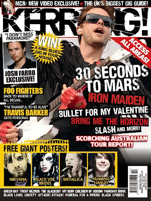 The fifth type of representation I will be looking at is youth, looking particularly at Stanley Hall's storm and stress model in which states "the common mood of all teenagers is depression' “Youth must have excitement and if this is not at hand in the form of moral intellectual enthusiasms it is more prone to be sought in; sex, drink or drugs" Halls has the idea that youth is simply rebellious nothing more, they need excitement. The cover to the right plays upon this stereotype. The Kerrang logo itself, very much so plays upon this recklessness ideology of youth through use of the shattered effect. The cover uses black throughout and only really uses yellow and red as contrasting colours, colours which in themselves have their own hidden meaning. The yellow is bright, vibrant and connotes danger, red on the other hand connotes lust, sex and violence. The use of red links well with Laura Mulvey's theory of gender. The use of black connotes depression and darkness which implies a particular stereotype towards the youth of today. I will use aspects in my production of a magazine as my target audience is 11-17 and so they need to be considered as a primary audience.
 The first representation theory I will look at is Gender. One of the most renowned names revolving around this key representation is Laura Mulvey, her Male Gaze theory of 1975 states that females are simply used in magazines and other popular media as "erotic objects of desire". The theory in action can easily be found in today's modern society, it can be also be applied to both genders. The theory is dated and in 1975 men typically earned more that woman, the media institutions would of recognised this, calling upon the need for such explicit use of woman and not men, at the time. The use of woman in media is simply to sell to men. An example of this theory is shown on the right. Popular pop artist, Lady Gaga is shown wearing next to nothing, enough to keep it clean enough to be on the cover of a magazine, but risqué enough for potential male readers taking an interest in the image, and the image only. Lady Gaga is potentially seen as an object of sexual desire to some and the image of her in an erotic pose, with one hand over her breast and the other left to imagination, simply intensifies this desire. In terms of the lexis, the word "unzipped" is seen under her name. This connotes a certain sexual tension, unzipped is used in this particular example and throughout the media industry as a term that strips back the artist to the individual they are, without the costumes and act that most artists find fame in. However in this case it has a secondary meaning, on Lady Gaga's costume a zip is visible on her costume, pulling in a whole new meaning and sexual desire over the word "unzipped". The combination of, Lady Gaga, world wide known superstar, erotic posing and playful lexis all supports Mulvey's Male Gaze theory. All of these factors help to attract a male target audience to this day, personally I think that the use of females in magazines is effective and will possibly incorporate the fundamental basis of the theory into my magazine in order to represent my audience effectively.
 The next representation theory that I will look at is sexuality. Sexuality is a controversial issue within today's modern society and typically always has been. It is seen as normal behaviour to be heterosexual as this arguably is how humans procreate, a homosexual relationship can only produce a child through surrogacy or artificial insemination, however the stigma towards bisexuals and heterosexuals is slowly dying and will only remain in those are are unable to adapt to a changing modern society. The image to the right represents the stereotypes within sexuality, particularly males. The heavy use of dark make up surrounding the eyes is arguably simply a emo or gothic stereotype however it also applicable to sexuality. The use of make up on a man is seen as emasculating as make up is typically used by females. The artists long hair and dark clothing simply magnifies the defining first glance thoughts and feelings towards him. This theory is not clearly represented in the cover to the right, personally I would say is partially represents some sort of sexual representation however is more well suited for demonstrating emo or gothic stereotypes. Arguably the flamboyance of the artist may be attractive to both males and females which is beneficial to a magazine institution hoping to get that largest possible target audience that it can, I will not be using this theory within my own magazine as it is a music magazine and can music really be homosexual ? The representation of sexuality would be better found in a lifestyle magazine.
 The third type of representation I will be looking at is ethnicity. Primarily Sarita Malik's theory of 1998. "Many feel that Black and Asian audiences are still not sufficiently catered for and that insensitivity towards issues of race and ethnicity still exist. The reality of a lived multiculturalism is not represented in the British media" This theory is not accurate when looking at today's modern society where multiculturalism is very much present within British media. An example of which is shown to the right. Dizzee Rascal looks joyous and this links well with his quote beneath. "I'm spreading joy around the world, man!" This goes against the theory of black people simply being trouble makers or deviants.
'Certain images of Black people as deviant trouble-makers, for example, are perpetuated by the media in order to encourage the mass audience to view blacks in a certain way'. Ethnic representation is not something that will be found in my magazine as my target audience is the White British population, however the use of representing different ethnicities, particular ethnic minorities who have found success is begginning to become increasingly popular in the magazine industry and the media industry as a whole.

The fourth type of representation I will be discussing is nationality. Andrew Higson's theory of 1998 states 'Identity is generally understood to be the shared identity of naturalized inhabitants of a particular political-geographic space – this can be a particular nation or region'. The magazine shown on the right revolves the idea of Americanism, the entire colour scheme is built up upon the colours of the American flag even the artist's costume. The representation of nationality is a dying feature, people care more about how good the music over the fact that the artist is from America. Artists are really only renowned for their nationality within their own nation. Adele is British, British people know this and British people brag about her to Americans. It is the same story for America and Britney Spears. Media that revolves around one nation and is used in that nation is effective, however it is not as successful when used in other nations. I will not be using the theory of nationality in my magazine as it seems as though my target audience is primarily British and having the whole magazine revolving around the ideology of Britain rather than the music itself is a bad decision as I am attempting to attract those who are interested in indie music, people who care about the music rather than the act, costume and commercialism behind it.
 The fifth type of representation I will be looking at is youth, looking particularly at Stanley Hall's storm and stress model in which states "the common mood of all teenagers is depression' “Youth must have excitement and if this is not at hand in the form of moral intellectual enthusiasms it is more prone to be sought in; sex, drink or drugs" Halls has the idea that youth is simply rebellious nothing more, they need excitement. The cover to the right plays upon this stereotype. The Kerrang logo itself, very much so plays upon this recklessness ideology of youth through use of the shattered effect. The cover uses black throughout and only really uses yellow and red as contrasting colours, colours which in themselves have their own hidden meaning. The yellow is bright, vibrant and connotes danger, red on the other hand connotes lust, sex and violence. The use of red links well with Laura Mulvey's theory of gender. The use of black connotes depression and darkness which implies a particular stereotype towards the youth of today. I will use aspects in my production of a magazine as my target audience is 11-17 and so they need to be considered as a primary audience.
Wednesday, 4 December 2013
Construction of Double Page Spread

I started the production of my double page spread by adding the image of the star model. I used the guide tool to find the exact centre of the page and then began using the magic wand tool to erase anything past the line that was not part of the star model in order to give me the effect shown above.

I then added the black bar at the top stating exactly what the article below was going to be about, I had used the black bar in both the contents page and cover page so thought it was necessary to keep to the same style and continue the convention.

I then added a quote from the interview in a large red font, closely spaced together, this immediately draws attention to the page itself and was a common convention found in magazines such as Kerrang and Q. It also gives the reader an insight as to something the star model has said and may tempt them to read the full article.

I then added the article itself, using the guide tool to find the centre of the right page I decided to pick a design that clearly shows what the interviewer is saying and what the star model is saying, this type of design would of not been effective if I were writing a different type of article such as a review. I also added the black bar at the bottom as the page lacked depth, adding the black bar made the page look more interesting and also helped me to add more colour into the page itself.
Subscribe to:
Posts (Atom)