The main
image takes
up the whole poster by having the main character in a long shot. The antagonist
complied with the rule of thirds which is a common convention in film posters.
The audience’s attention is immediately attracted to the antagonist because he is
in the middle of the poster and this will strike fear into the target audience
because he has a weapon and is a dark scary killer. The antagonist wears a mask
to seal his identity which intrigues the audience because they want
to know what’s behind the mask. This masking of
the
antagonist links back to the horror genre because it is common for antagonist
wanting to hide their identity to strike fear into their victims. The black
clothing is stereotypically linked to the horror genre and this is to blend in
with the darkness of the night which makes it easier to sneak upon people. The
background behind him is forest like show a rural location for the film, which
is common in horror films because in the woods people are very alone and there
is no help. This background has been edited through the use of Photoshop
because the forest background has a misty darkening effect which does not look
natural. This could connote something happening in the film that is unnatural,
dark and dramatic.
The
title has been placed in the central column of the rule of thirds near
the bottom of the poster in the lake water. It has been placed against the dark
lake water to make it stand out against the main image but at the same time not
over power the poster. The colour of the typography is very effective because
its bright red against the dark lake it makes it stand out. The red links back
to the horror genre because it could be seen as blood which is a common horror
genre convention. The typography being capitalised makes it look more
important, stands out and looks very effective.
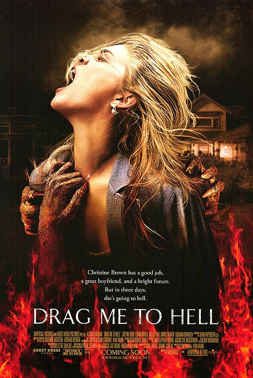
Drag me to hell (Image to be added)
The
main image has been placed in the middle of the poster across the rule of
thirds taking up most of the space on the film poster. This has been done so
that the audience’s attention is attracted to the striking image because it is
the main selling point of the film. The women looks as though she is being
dragged down to hell by the hands around her but she is putting up a
fight, the audience will link the flames rising up are coming from hell because
of the stereotype they have been given within the past. This has been edited
through the use of Photoshop to create a dramatic image that the target
audience will remember thus will go to see the film. The idea of the devil
coming out from the underworld reflects the horror genre to the audience. The
hands around her have been carefully made up through use of make-up and
editing to create the dark and devil hands to reflect the horror genre. The
dark sky behind the women emphasize the darkness and importance of the
situation. Darkness is also a key fear factor in horror films as it creates
the idea of the unknown. The houses behind her add to the background effect of darkness
and her isolation. She is screaming within the main image to make it look as though
she is going to put up a fight but also to show her pain and resistance into the
darkness which is common is horror film posters because the audience then
sympathise with the main character. The editing of this image is dark and grey to
comply with the overall mise en scene and to fit in with the horror genre.
The masthead
of this poster reads the title of the film ‘Drag Me To Hell’. The title has
been placed in the central column of the rule of thirds at the bottom of the
poster. This has been done as to not take attention away from the dramatic main image
which is the film’s main selling point, but still big enough to inform the
viewer. The
typography chosen for this title is very effective due to the scratched out effect
it looks as though the fire is starting to burn the masthead away and bits have
flaked off. This certain typography has been chosen to convey the horror genre to
the audience as it gives the target audience the idea of the burning and
makes them feel unease. The masthead has chosen the word ‘Drag’
to show there will be a fight within the film but also as used the word ‘Me’ to make
it personal for the audience which will make it eye catch for the readers because
they will feel like they are being spoken to directly. The word ‘Hell’ immediately
tells the target audience that the film is of the horror genre as the
audience will automatically be making links to the devil which are conventions of
the horror genre. The colour of the typography is white which fits in with
the colour scheme but also it shows that innocence is being lost to hell/the
flames.


• There is basic research into similar products and a potential target audience
ReplyDelete