Friday, 7 November 2014

Primary Audience


In order to find out who my target audience is for my short film I conducted a survey using the online service, "Survey Monkey". I asked 10 questions in order to get a general idea on who my primary target audience would be.
It is clear to see from the answers to my first question that the most frequently answered option was 14-17 year olds followed by 18-20 year olds. This means that my primary audience for my short film would be 16-21 year olds meaning I will need to take into consideration their needs as a group in order to get them interested in watching my short film.

From these results to my second question I can see that I have no primary audience in terms of gender and I should cater to the needs and requirements of both genders in stead of just catering to the one and potentially losing a large majority of my audience.

From these results I can see that my target audience in terms of their average household income per year is those in social grades between E and C2. This is not surprising looking back at the age of my target audience, most of my audience will be college or university. This does not necessarily mean that I need to represent them in my short film particularly however it may make the film slightly more relatable.

From these results I can see that primarily my audience is heterosexual with only one person answering "homosexual". Society in general is far more accepting of homosexuals in todays modern society compared to their acceptance in the past. I don't think that these results should have too much influence on the content and character choices made in my short film, I also don't think that my chosen genre, horror/thriller is an appropriate genre to explore character sexuality. 

From these results I can see that my audience has very mixed opinions from British short films with the majority of the people asked saying "sometimes". This may mean indicate an interest in British short films however they are yet to begin watching British short films as much as they do regular films or TV. In terms of my short film I can attempt to increase the interest in British short films by making something unique which could encourage my audience to watch more British short films.

From these results I can see that Horror/ Thriller is the most favoured genre from the people that I asked. My short film needs to fit into this genre in order for it to be popular.


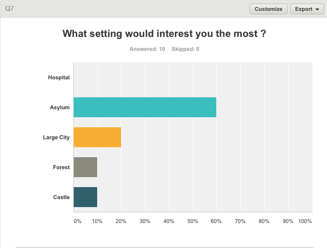
From these results it is clear that an Asylum is the most interesting setting which ties in nicely with my previous questions results which told me that the Horror/Thriller genre is the most favoured genre.


From these results I can see that "No Escape" is the most popular option and so this will be the name of my Horror/Thriller short film. 


From these results it is clear to see that the most interesting log line which i can use as a basis for my story is "Franklin a boy in trouble with schizophrenia is lured into a old run down asylum by his imaginary friend Toby. There is No Escape.


This research has helped me vastly understand who exactly my target audience is and has helped me make some critical decisions regarding the content of my short film.


Thursday, 6 November 2014

Lighting research

The Three Point Lighting Technique is a standard method used in film, still photography and computer-generated imagery. Lighting is a very important aspect  in film making and can be used to create an atmosphere without much effort.


Three types of lighting in film making
Key Light - This is the main light. It is usually the strongest and casts the most light on the scene. It is placed to one side of the camera/subject so that this side is well lit and the other side has some shadow.

Fill Light - This is the secondary light and is placed on the opposite side of the key light. It is used to fill the shadows created by the key. The fill will usually be softer and less bright than the key. 
Back Light - The backlight is placed behind the subject and lights it from the rear. Rather than providing direct lighting (like the key and fill), its purpose is to provide definition and subtle highlights around the subject. 


Wednesday, 8 October 2014

Horror Poster Analysis

Friday the 13th (Image to be added)

The main image takes up the whole poster by having the main character in a long shot. The antagonist complied with the rule of thirds which is a common convention in film posters. The audience’s attention is immediately attracted to the antagonist because he is in the middle of the poster and this will strike fear into the target audience because he has a weapon and is a dark scary killer. The antagonist wears a mask to seal his identity which intrigues the audience because they want to know what’s behind the mask. This masking of
the antagonist links back to the horror genre because it is common for antagonist wanting to hide their identity to strike fear into their victims. The black clothing is stereotypically linked to the horror genre and this is to blend in with the darkness of the night which makes it easier to sneak upon people. The background behind him is forest like show a rural location for the film, which is common in horror films because in the woods people are very alone and there is no help. This background has been edited through the use of Photoshop because the forest background has a misty darkening effect which does not look natural. This could connote something happening in the film that is unnatural, dark and dramatic.

The title has been placed in the central column of the rule of thirds near the bottom of the poster in the lake water. It has been placed against the dark lake water to make it stand out against the main image but at the same time not over power the poster. The colour of the typography is very effective because its bright red against the dark lake it makes it stand out. The red links back to the horror genre because it could be seen as blood which is a common horror genre convention. The typography being capitalised makes it look more important, stands out and looks very effective. The masthead references to a specific date where people believe bad things happen on that date which is a superstition and it is heavily enforced by horror films.

Drag me to hell (Image to be added)

The main image has been placed in the middle of the poster across the rule of thirds taking up most of the space on the film poster. This has been done so that the audience’s attention is attracted to the striking image because it is the main selling point of the film. The women looks as though she is being dragged down to hell by the hands around her but she is putting up a fight, the audience will link the flames rising up are coming from hell because of the stereotype they have been given within the past. This has been edited through the use of Photoshop to create a dramatic image that the target audience will remember thus will go to see the film. The idea of the devil coming out from the underworld reflects the horror genre to the audience. The hands around her have been carefully made up through use of make-up and editing to create the dark and devil hands to reflect the horror genre. The dark sky behind the women emphasize the darkness and importance of the situation. Darkness is also a key fear factor in horror films as it creates the idea of the unknown. The houses behind her add to the background effect of darkness and her isolation. She is screaming within the main image to make it look as though she is going to put up a fight but also to show her pain and resistance into the darkness which is common is horror film posters because the audience then sympathise with the main character. The editing of this image is dark and grey to comply with the overall mise en scene and to fit in with the horror genre.

The masthead of this poster reads the title of the film ‘Drag Me To Hell’. The title has been placed in the central column of the rule of thirds at the bottom of the poster. This has been done as to not take attention away from the dramatic main image which is the film’s main selling point, but still big enough to inform the viewer. The typography chosen for this title is very effective due to the scratched out effect it looks as though the fire is starting to burn the masthead away and bits have flaked off. This certain typography has been chosen to convey the horror genre to the audience as it gives the target audience the idea of the burning and makes them feel unease. The masthead has chosen the word ‘Drag’ to show there will be a fight within the film but also as used the word ‘Me’ to make it personal for the audience which will make it eye catch for the readers because they will feel like they are being spoken to directly. The word ‘Hell’ immediately tells the target audience that the film is of the horror genre as the audience will automatically be making links to the devil which are conventions of the horror genre. The colour of the typography is white which fits in with the colour scheme but also it shows that innocence is being lost to hell/the flames.


Monday, 29 September 2014

Analysis of Double Page Film Review


The first poster is from 2009 when Avatar was released, the first thing that I can notice at a first glance is that the magazine has decided to use minimal text where possible and they have focused more on using image to build up the double page spread.

 The page colours follows a black, orange and white colour palette with a black background, orange contrast text boxes and white text. This is an effective move and the use of black and white with a contrasting colour seems to be a popular convention throughout film magazine. I should take this into consideration when I am creating my own magazine review for my film (No Escape)

 The typography is very basic on this double spread however this is not surprising seeing as the majority of the page is made up of pictures and so is obviously what the magazine wants the reader to be looking at and so using a complicated or fancy typography style is quite contradictory.

The main image is the largest picture and shows the two main characters from the movie. The man is almost looking at the reader and the female seems to be looking at him, trying to get his attention, she also looks worried about something. This is an effective picture to use in a review as it shows off the characters and gives us an idea of the film is about, however it does not give the average customer an in depth spoiler ridden picture. Other pictures are used in this piece that look like screenshots from the actual film which is effective as it gives the reader an insight as to what they will actually be looking at whilst watching the film without giving too much away regarding the plot and story of the movie.

In terms of the lexis used on this double page feature are the words "film of the month" and "popular facts". The use of the phrase "film of the month" instantly gives the reader an insight into what the magazine thinks of the magazine, similar to what is the opinionated language used in my second double page film review analysis. The use of "popular facts" give the reader an insight into the film without having to read the long article which is an effective move.


This magazine's film review is in on Spiderman 2 and from a first and the first that it noticeable is that it is a lot more text heavy compared to the first magazine review. Person I see this is a negative as it makes the magazine look very cluttered however this magazine may be for readers who prefer to know a lot more about the story compared to the first magazine which was just pictures. The first magazine is more likely to be read by this who are more interested in how the film will look rather than what the story is about. The colours used in this magazine review of spiderman are very effective. Spiderman's costume is blue and red and the film review page has to some extent followed this colour scheme. Using the colours found in the feature picture is a common convention of film review pages in magazine and so I should consider using the same method when creating my own.

As for the typography on this piece there does seem to be quite a lot of text for a film review, the headings such as "VERDICT" and "SPIDERMAN 2" all seem to follow the same font which is a very effective method as it makes it very easy for the reader to look at the information they are interested in at a glance and understand where the headings start and stop. The actual article is nothing special and follows the conventions of printing text in magazine following a basic layout. The entire layout of the double page spread is very basic, using mainly rectangles and squares to construct the page. This may be seen as an effective move as it does not confuse the reader however a layout that was a bit more complex may make the article a bit more appealing to look at.

In terms of the lexis on this double page feature, the rating system that the magazine uses for its magazine is very interesting, using words such as "must-see" and "dire" is a an effective move by the magazine instead of using generic adjectives such as "Good" and "Bad". The sub heading "the amazing spidey swings to new heights in sam raimi's jaw-crushing sequal" immediately give the reader a general idea of what the magazine thinks of the film which is an effective move as it means that readers who do not wish to read the full article can still see what the magazine thinks of the film at a glance. The film does however mention some complaints regarding the film however this review does seem to be one sided and heavily opinionated.

The image used of spiderman is a high quality snap from the film and using a snap from a film compared to a piece of promotional artwork is a lot more effective in my opinion as it gives the reader a short glance into what they will actually be looking at in the movie. Often in promotional artwork that is produced for movies effects are added that make the film look a lot more impressive than it actually is.

Monday, 22 September 2014

Synopsis

Franklin, your average teenage boy who day to day struggles with schizophrenia and his imaginary friend, Toby. One night Toby becomes very persistent in demanding Franklin's attention by telling him to go into the old mental asylum. Franklin follows Toby's order, becoming trapped inside the asylum. Franklin becomes panicked and his mentality begins to break down. The asylum fills with dead bodies and blood, Franklin runs from door to door desperately scouring for an exit. There is No Escape. Franklin collapses. After regaining conciousness Franklin finds himself back in his bedroom being ushered by Toby to return to sleep. Franklin fades back into his rest, however this was only the beginning

Short Film Analysis

Maniac (2011) is a short horror mockumentary about a camera crew that follows two serial killers. This is not a very interesting film however the cinematography throughout the film looks very professional. 

The films starts in what looks to be a suburban neighbourhood, the camera pans alone the street and you can already notice the lack of colour, a feature that is effectively used throughout the film. I would not go as far to say that the film is shot in black and white however the colours are extremely unsaturated in order to give a very gritty feel to the content. The camera continues to pan and eventually we pass a house, similar to the others that have already passed, however this house is on fire. The camera does not stop on the house on fire or even slow down which would indicate interest. It continues to pan and eventually the pan shot become a tracking shot when two males are seen walking down the street with a gasoline can. The track lasts a number of seconds before the pace of the camera increases and eventually returns to a pan.

The location changes and as does the camera view, now set in a diner we see a birds eye view of people eating and drinking at a diner, the shot is also panning to the right. Dialogue is heard whilst the camera is panning and the pan eventually slows to the two main characters who are also enjoying a meal at the diner. A very interesting camera angle and shot is used when one of the character's is finishing their sentence. The camera angle changes to eye level and the character looks directly down the lens when he is speaking. This gives the audience a very personal connection to the character talking as if he was talking to them and also creates a very tense and dark atmosphere given the nature of his dialogue. The camera changes to face the man he is talking to, who again is looking directly down the camera, he smiles, but only for a second before his face turns back to normal and the scene changes.

The second man is now seen sitting on a bench, a wide shot is used as a men walking a dog enters the scene from the right and passes the bench behind where the man is sitting. As the man passes the exact middle of the bench the angle changes to show us the face of the man sitting on the bench who turns to follow the direction of the man walking the dog. This is an very good example of professional cinematography and continuity. The scene changes now to the first man who is seen getting on a bus, however the camera is extremely shaky and we can tell from this that the director is trying to replicate a handheld camera in order to give the audience a sense of realism. We later find out that the two men are being followed be camera crews and so the use of the "handheld" camera was a very effective move. This is also made clear as we don't follow the man onto the bus, instead we watch him get on it and then track him to the back of the bus, through the bus windows where he eventually finds his seat.

As the bus pulls away we notice the handheld camera effect used again, this time not focusing on either of the men and instead focusing on the camera crew, we hear a small piece of dialogue saying "come on we are losing them" as the camera crew continue to enter a large black van. 

The scene changes to a woman walking in the snow, the camera shot is from behind and it gives the audience the illusion that she is being followed. The camera is again very shaky, however very effective, especially when the first man comes in from the right and appears to be walking very aggressively. The man grabs the woman and attempts to strangle her before hitting her and pushing her into the snow where the scene changes. This is very effective as we are unsure as to the woman's fate.

The scene very quickly changes in this case to the second man who is now in an alleyway following the man walking his dog. The scene again is shot from behind as to add to the sense that the man is being followed. The second man continues to attack the man and drags him down into the snow. The scene changes yet again, this time back to the first man and the woman in the snow. The show is looking up at the man giving the connotation that the man is powerful, he is dominant. It also helps add to the feeling of helplessness the woman must feel in that situation. The man pulls out a knife and continues to stab the woman. The scene changes one more time to the second man who is now strangling the man with the dog. 

We return to the first man, the camera is very still and we are on level with the snow looking at the woman's corpse and the man lingering above it. He continues to kiss the woman on the lips, this really does add to the psychopathic feeling felt from both of the two men. It is also gives us a clear indication as to why the film is called "Maniac" as this is exactly what both these men are. The man finishes kissing the woman and stand up, the camera follows, following the trend of the handheld camera effect used throughout the film.

The entire film continues following the gruesome and gory killings of innocent people committed by the two men. I feel as though this is an appropriate short film to analyse because of how dark it is. We are making a phychological thriller and I feel as though our movie can learn vastly from the effective use of cinematography shown throughout this short film. 


Perfection (2004)

Perfection is a film about an Asian-American woman who from birth is pressured into living a perfect lifestyle, forced primarily by her mother. At the beginning of the film the child is presented with a game known as "PERFECTION" which involves placing differently shaped counters into their respective holes. The film starts with a black screen which moves gently over the screen revealing the name of the film, which is also the name of the game This is an effective use of cinematography and editing as it adds supsnese and mystery at the very beginning of the film. Other features are also revealed of the game including the ticking clock and also the holes in the game board.

The entire film is shot in black and white and this may indicate the feelings felt by the little girl by the film. It is an connotation of how boring her life is. No colour is used throughout the film in any shape or form. Seome very interesting shots are used thoughout the film, medium long shots and close ups are used throughout however the focus remains the same on two things in the film. The game (Perfection) and the girl. Even the shots that include the mother do not show her face and only show her from the next below. Almost as though she is not important, but her daughter is exceptionally important.

The film follows the girl throughout her life as she begins to win trophies, however the scences are almost always followed by close up, disoreintating shots of the PERFECTION game and although it becomes expected as the film progresses it still is an effective way of reminding the audience that this girl was deep effective by the concept of the game and the pressure by her parents to be perfect. 

As she gets older, the woman finds it harder and harder to achieve perfection, she tried to expand the concept of perfection to everything, Her weight, her job, the way she dresses and even attempts to fix another woman's wedding dress veil however the expression on her face clearly shows at that point that she feels she has not achieved Perfection and therefore is not happy. 

The film speeds up towards the end, particularly within the transistions between the different shots of the different parts of her life, the metronome, the working out and her job. The disorientating close up shots of the "PERFECTION" game is really effective in emphasising the importance and impact that the game had on her life and also is good at throwing off the audience, attempting to represent the busy, stressful life that the woman now has to deal with.

Initial Thoughts

I am excited to be creating a short film. I am working with two other people to produce a psychological thriller. It is something I have never attempted before so every I do during this is a new experience for me. I am especially excited for editing the film and using the different effects and sfx to produce a high quality short film.